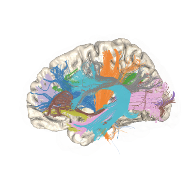
Creating tract density maps of callosal bundles#
This example shows how to use the AFQ API to delineate the callosal bundles and then compute tract density / visitation maps at both the individual and group level.
import os.path as op
import matplotlib.pyplot as plt
import nibabel as nib

import plotly

from AFQ.api.group import GroupAFQ
import AFQ.api.bundle_dict as abd
from AFQ.definitions.image import RoiImage
import AFQ.data.fetch as afd
Get some example data#
Retrieves Stanford HARDI dataset.
afd.organize_stanford_data(clear_previous_afq="track")
Set segmentation parameters (optional)#
We make this segmentation_params which we will pass to the GroupAFQ object which specifies that we want to clip the extracted tract profiles to only be between the two ROIs.
We do this because tract profiles become less reliable as the bundles approach the gray matter-white matter boundary. On some of the non-callosal bundles, ROIs are not in a good position to clip edges. In these cases, one can remove the first and last nodes in a tract profile.
segmentation_params = {"clip_edges": True}
Initialize a GroupAFQ object:#
We specify bundle_info as the callosal bundles only
(abd.callosal_bd). If we want to segment both the callosum
and the other bundles, we would pass
abd.callosal_bd() + abd.default_bd()
instead. This would tell the GroupAFQ object to use bundles from both
the standard and callosal templates.
myafq = GroupAFQ(
    bids_path=op.join(afd.afq_home, 'stanford_hardi'),
    dwi_preproc_pipeline='vistasoft',
    t1_preproc_pipeline='freesurfer',
    bundle_info=abd.callosal_bd(),
    segmentation_params=segmentation_params,
    viz_backend_spec='plotly_no_mp4')

# Calling export all produces all of the outputs of processing, including
# tractography, scalar maps, tract profiles and visualizations:
myafq.export_all()
Create tract density maps:#
pyAFQ can make density maps of streamline counts per subject/session
by calling myafq.export("density_map"). When using GroupAFQ, you can also
combine these into one file by calling myafq.export_group_density().
group_density = myafq.export_group_density()
group_density = nib.load(group_density).get_fdata()
fig, ax = plt.subplots(1)
ax.matshow(
    group_density[:, :, group_density.shape[-1] // 2, 0],
    cmap='viridis')
ax.axis("off")
Visualizing bundles and tract profiles:#
This would run the script and visualize the bundles using the plotly interactive visualization, which should automatically open in a new browser window.
bundle_html = myafq.export("all_bundles_figure")
plotly.io.show(bundle_html["01"][0])